In today’s fast-paced world, creating visually appealing charts is no longer a luxury it’s a necessity. Whether you’re presenting data for business, education, or personal projects, having a tool that simplifies the process can save hours. Chartify is an AI-powered chart and visualization tool that makes creating stunning charts easy, even for beginners. In this guide, we’ll explore everything you need to know about Chartify, including tutorials, examples, pricing, and helpful tips.
What is Chartify?
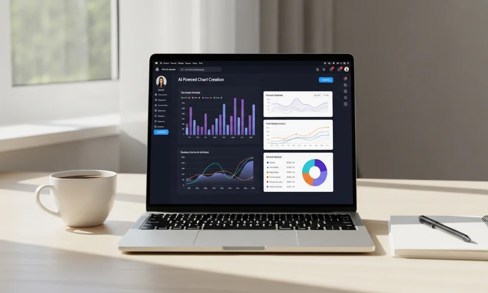
Chartify is an AI-driven tool designed to create charts and visualizations effortlessly. It allows users to transform raw data into professional-looking graphics in minutes. The tool is perfect for marketers, educators, analysts, and students who need quick visual insights. With Chartify, even someone with zero design experience can make charts that look polished and engaging.
It supports a variety of chart types, from bar and line charts to more complex visualizations. The AI suggestions help users choose the best chart type for their data. Chartify also provides templates to speed up the process, making it a versatile choice for anyone. This online chart generator is an ideal solution for simplifying data presentation effectively.
Key Features of Chartify
Chartify comes packed with features that make it stand out from other visualization tools. The platform is built for simplicity and efficiency. Every feature is designed to make chart creation fast and intuitive.
Types of Charts Supported
Chartify supports a wide range of chart types to match different data needs. You can create bar charts, line charts, pie charts, and scatter plots easily. Additionally, it offers more advanced visualizations like heatmaps and area charts. Each chart type is fully customizable to ensure clarity and aesthetic appeal.
Customization Options
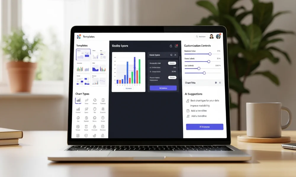
Customization is one of Chartify’s strongest points. You can change colors, fonts, labels, and axes in just a few clicks. The tool allows users to match charts with their brand or presentation style. These simple customization options make charts look professional without much effort.
AI-Powered Suggestions
The AI feature in Chartify recommends the most suitable chart type for your data. This reduces trial and error while creating visualizations. Users can focus more on analysis and presentation rather than chart formatting. The AI suggestions also help beginners avoid common visualization mistakes.
How to Use Chartify: Step-by-Step Tutorial
Creating charts with Chartify is quick and easy. The process is straightforward and designed for users of all skill levels. Following a simple step-by-step approach ensures efficient chart creation.
Signing Up and Setting Up
First, you need to create a Chartify account. Visit the Chartify website and sign up with your email or social media accounts. Once registered, you can access the dashboard and explore templates. The setup process is user-friendly, making it perfect for beginners.
Creating Your First Chart
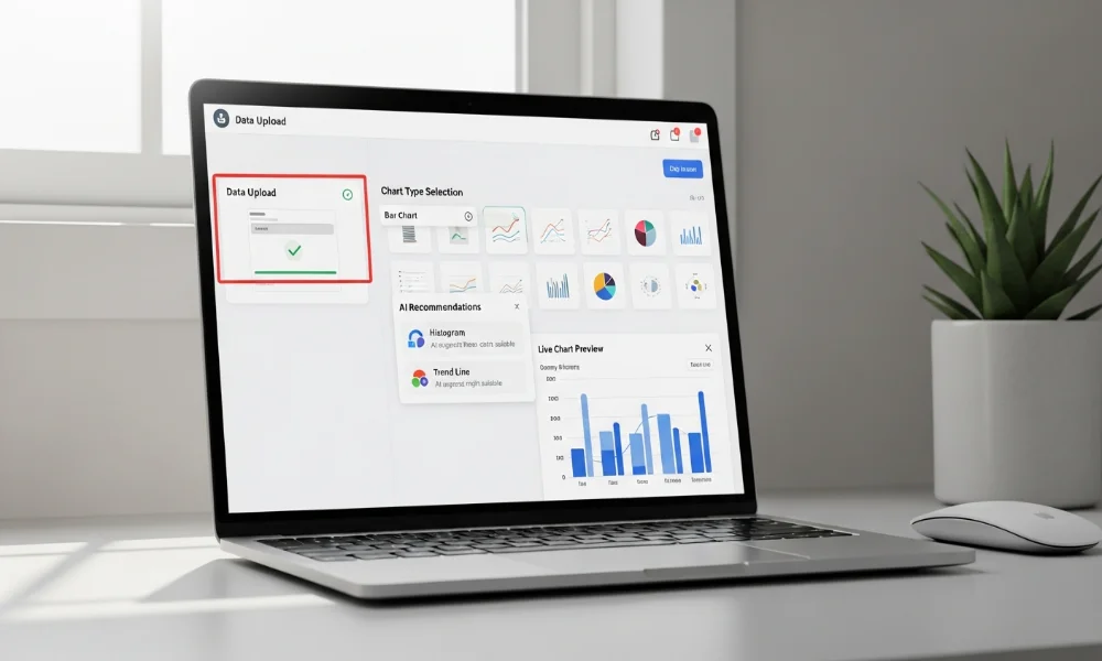
To create a chart, upload your data in CSV or Excel format. Select the type of chart you want, and Chartify’s AI will suggest the best layout. You can customize colors, fonts, and labels to suit your preferences. Within minutes, your chart is ready to use in presentations or reports.
Exporting & Sharing Options
Chartify allows easy exporting of charts in PNG, JPG, or PDF formats. You can also share charts directly via a link or embed them on websites. This flexibility ensures that your visualizations reach the intended audience effectively. The sharing options make collaboration seamless for teams and clients.
Chartify Examples and Templates
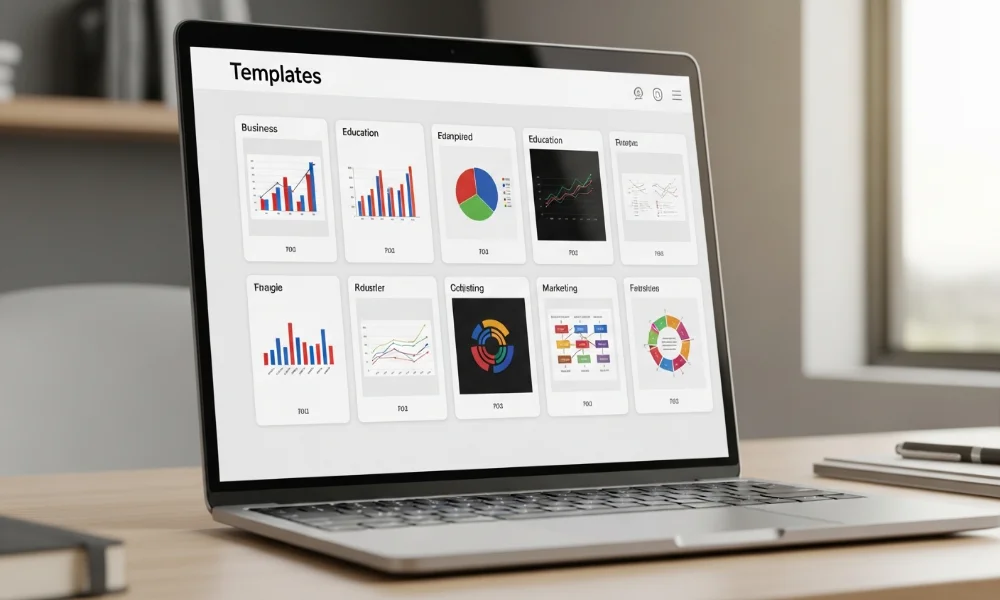
Using examples can inspire better chart designs. Chartify provides a range of templates suitable for various industries. Templates save time and ensure charts are visually consistent.
Examples for Business Analytics
Chartify is excellent for presenting sales, revenue, or market trends. You can create dashboards that highlight KPIs clearly and efficiently. These charts make complex data easier to understand for managers and stakeholders.
Examples for Education & Research
Students and educators can visualize research findings effectively using Chartify. Charts can simplify statistical data for reports and presentations. Teachers can also create visual aids that enhance learning experiences.
Examples for Marketing Campaigns
Marketers can track performance metrics like engagement rates or conversions visually. Data visualization helps identify trends and improve campaign strategies. Chartify templates make it quick to generate insightful marketing charts.
Chartify Pricing Plans
To meet different requirements, the platform provides several pricing options. Additionally, each plan is designed to fit both beginners and professional users. There is a free plan with basic features and paid plans with more advanced tools. This flexibility makes it accessible to beginners and professionals alike.
| Plan Name | Features Included | Price |
|---|---|---|
| Free | Basic chart types, limited templates | $0/month |
| Pro | Full chart types, advanced templates, export options | $9.99/month |
| Business | Team collaboration, priority support, branding options | $29.99/month |
| Enterprise | Custom solutions, API access, dedicated support | Contact Sales |
Paid plans offer enhanced functionality, ideal for teams and professionals. You can start with the free version to explore the platform. Upgrading provides access to advanced features that save time and improve presentation quality.
Pros and Cons of Chartify
Chartify is a powerful tool, but it has its strengths and limitations. Knowing these can help you decide if it’s right for you.
Pros:
-
Easy-to-use interface for beginners
-
AI-powered suggestions for optimal charts
-
Wide range of chart types and templates
-
Export and sharing flexibility
Cons:
-
Free version has limited features
-
Advanced analytics require paid plans
-
May not replace complex software for heavy data analysis
Alternatives to Chartify
While Chartify is excellent, there are other tools worth considering. Alternatives offer similar functionality for different use cases.
-
Canva: Great for design-focused charts and visuals
-
Google Charts: Free and integrates well with Google Workspace
-
Infogram: Offers interactive charts for web use
-
Tableau: Advanced analytics for business intelligence
-
Excel/Google Sheets: Basic but flexible for quick charts
Using alternatives depends on your requirements and budget. Chartify remains a strong choice for quick, visually appealing charts.
Tips for Getting the Most Out of Chartify

Maximizing Chartify’s potential ensures you get professional results quickly. Simple practices can improve both efficiency and chart quality.
Shortcut Tips
Use keyboard shortcuts to speed up chart creation. Keep a library of favorite templates for repeated use. Organize charts by categories for easy access in large projects.
Best Practices for Data Visualization
Always label axes clearly and use contrasting colors for readability. Avoid clutter by limiting the number of data points per chart. Use Chartify’s AI suggestions to pick the most appropriate chart type.
Following these practices ensures charts are not only visually appealing but also effective in conveying data insights.
Conclusion
Chartify is a versatile AI-powered tool that simplifies chart creation for everyone. Whether you are a student, marketer, or analyst, it helps visualize data quickly and beautifully. From templates and AI suggestions to flexible exporting options, Chartify meets diverse needs efficiently. Try the free version today and experience how easy creating stunning charts can be. Start turning your data into visuals that impress and inform effortlessly.